In the world of performance marketing, every second spent navigating complex interfaces is time not spent optimizing campaigns and driving growth. Today, we're thrilled to announce a complete reimagining of the Fospha platform with Polaris design system—a transformation built around one central question: how can we help marketers make better decisions, faster?
What's Changed: More Than Meets the Eye
A Cleaner, More Focused Interface
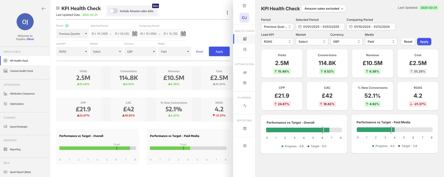
We've significantly reduced visual clutter across key dashboards, creating more breathing room for your data to tell its story. By eliminating unnecessary elements, we've created an environment where critical performance insights naturally stand out, making it easier to spot opportunities and challenges at a glance.
Intuitive, Seamless Workflows
Consistency matters. We've standardized interactions throughout the platform so you can confidently navigate from one section to another without having to relearn how things work. This consistency extends to every button, table, and visualization—creating predictable patterns that quickly become second nature.
Enhanced Data Visualization
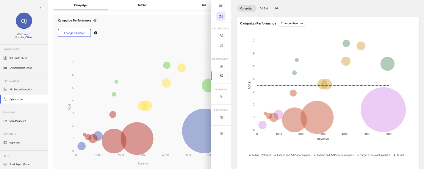
Numbers tell the story of your business, but only when they're presented clearly. Our refined color palette brings new clarity to complex visualizations like optimization bubble charts and attribution comparisons, making patterns and outliers immediately apparent.
Faster Platform Performance
Beautiful design means nothing if it doesn't perform. Every interaction in the new Fospha has been optimized for speed, from table manipulations to dashboard loading times. This means buttons that respond instantly, modals that behave predictably, and data that loads efficiently.
Designed With You In Mind
This redesign wasn't created in isolation—it was shaped by your feedback, challenges, and aspirations. Every decision was guided by a simple principle: "How will this help our customers make better decisions more confidently?" The result isn't just a more attractive platform—it's one that truly respects the complexity of your work by making it more manageable.
As one customer noted during early testing: "It looks very, very clean. I mean, the UI now, especially the customisation of the tables—it's exactly what we needed."
Tables That Work For You
Tables are the foundation of data analysis, so we've reimagined how they function. Enhanced search capabilities help you quickly find specific information, while intuitive column pinning and expanding features keep your most important metrics always visible. These improvements transform tables from simple data containers into powerful analytical tools.
%20(1).gif)
Customization Made Simple
The new customization modal introduces intuitive drag-and-drop functionality and simplified show/hide actions, making it effortless to configure your view to match your specific analytical needs. This level of personalization ensures you're always looking at exactly what matters most to your business.
-1.gif)
Streamlined Dashboards
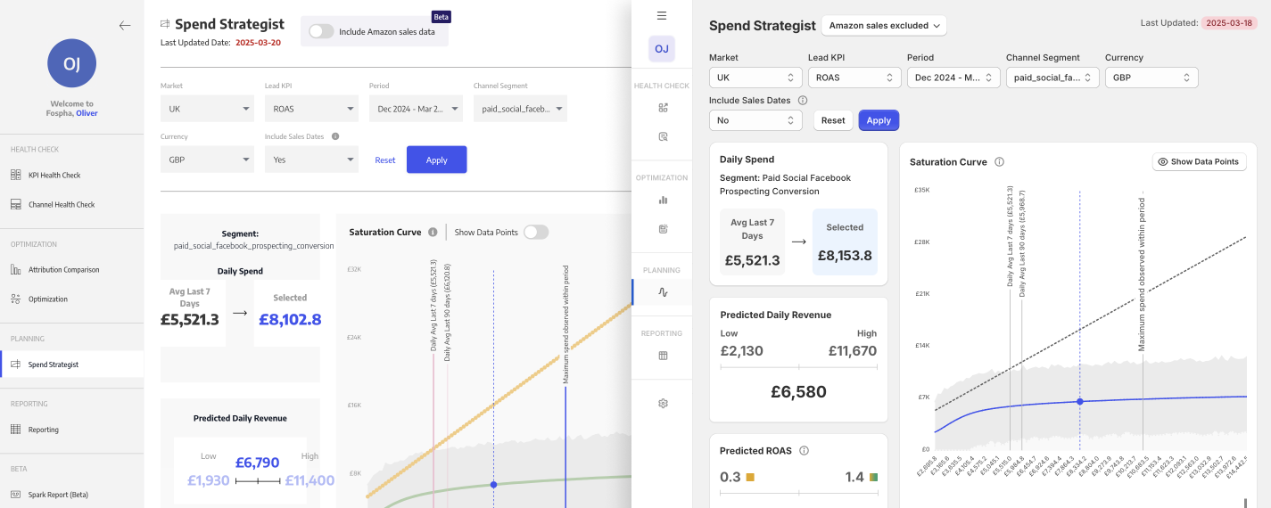
The Spend Strategist dashboard—one of our most-used features—has been thoughtfully decluttered, creating more visual space for the metrics that drive your decision-making. This focused approach helps you identify actionable insights more quickly without wading through unnecessary information.
-2.gif)
A Design System That Feels Familiar: Why We Chose Polaris
Our choice of the Polaris Design System was deliberate and strategic, offering three core advantages that directly benefit your experience:
Familiarity That Feels Like Home
Many performance marketers already navigate Shopify's ecosystem daily. By adopting Polaris, we've created an environment that feels instantly familiar. This means less time learning a new interface and more time extracting value from your data. The consistent patterns between tools reduce cognitive load and create a more integrated experience across your marketing technology stack.
Inclusive Design for Everyone
Accessibility isn't just a checklist for us—it's a fundamental commitment. Polaris has allowed us to implement thoughtful features like high-contrast color combinations for better readability, fluid typography that adapts to any screen size, and keyboard-navigable interfaces for those who cannot use a mouse. These improvements ensure that every team member can access critical marketing insights, regardless of their individual needs or working situations.
Faster Innovation
Behind the scenes, Polaris gives our engineering team a unified component library that accelerates development. This standardization means we can focus less on rebuilding interface elements and more on crafting the features you've been asking for. The result? A faster evolution of the platform that keeps pace with your growing needs.
Experience the Transformation Today
The new Fospha experience is now live and waiting for you. We invite you to log in today and discover how these thoughtful improvements transform your daily workflow. The difference is immediately apparent—not just in how the platform looks, but in how intuitively it responds to your needs.
